It’s been a while, eh?
Hi everyone. It has been a while since my last post. I have been busy with finishing my conference submissions and manuscripts. While working, one of my professors asked me and my colleague to perform a t-test for one of our projects. It was that time that I was introduced to a very helpful package called
ggstatsplot. I usually do t-test with thet.testfunction from the basestatspackage. It still works, but I found thatggstatsplotis more user-friendly as it provides visual of the results instead of just texts and numbers. Plus, I like graphing. It is fun and beautiful.The mentioned reason is why I decided to write this post as a way to introduce how useful
ggstatsplotis, as well as brushing up the basic knowledge of data exploration techniques that maybe simple but foundational to a lot of existing quantitative analysis techniques out there. It is almost a mandatory for every researchers to learn about these techniques in their introduction to research course. That is why I hope this post would serve as a useful reference for you all. I also want to keep things simple as a change to discussing about advance techniques like genetic algorithm and machine learning.In this post, I will be performing and visualizing data exploration techniques such as Pearson’s correlation test, Chi-square Goodness of Fit test, Chi-square Test of Independence, One-sample t-test, and Paired-sample t-test.
About the data, we will be using the student alcohol consumption data set, which is a survey data of students’ mathematics score from Portuguese secondary schools in 2005-2006 school year. The data is available in the University of California-Irvine machine learning repository and Kaggle. The data was collected and used by Cortez and Silva (2008).
Data Preprocessing and Assumption Check
- There are four packages that I used,
ggplot2for base data visualization,dplyrfor data manipulation,DataExplorerfor data summarization,psychfor descriptive statistics,rstatixfor preliminary analysis, andggstatsplot, the main package that we will play around today, for data visualization with statistical details.
- First, we will read the data set with
read.csv, convert the categorical variables into factors withas.factor, and subset relevant variables out withselect. It makes the data much easier to work with when we filter the variables that we want into a smaller data set.
- Next, we will explore variable type in the data set and missing value with plot_intro and proportion of categorical variables with
plot_bar. Both packages are from theDataExplorerpackage.
Show code
plot_intro(df_clean)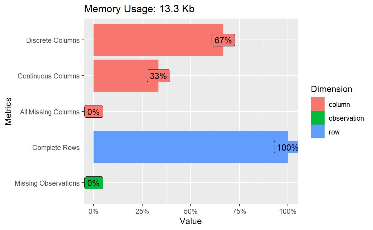
- The introduction bar plot shows no missing data. Majority of the variables are discrete, which are
sex- students’ biological sex,address- student’s home address type (binary: ‘U’ - urban or ‘R’ - rural),schoolsup- whether that student enrolls in extra educational support, andfamsup- whether that student gets educational support from their family. The remaining variables are continuous; those variables areG1- students’ score in the first data collection period, andG3- students’ final score.
Show code
plot_bar(df_clean)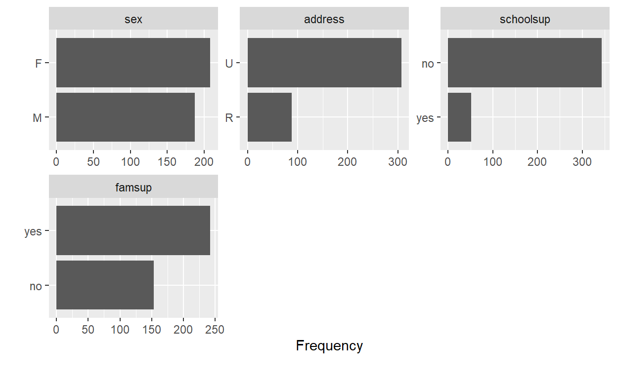
- The bar plots above show that the proportion between male and female students is rather balance. The proportion between students who receive educational support from family is skewed, and the proportion between students who receive extra educational support from school and students’ home address type are severely skewed.
- Next, we will perform preliminary analysis to check if our data follows assumptions of the test we will perform with the
ggstatsplotpackage. We will use descriptive statistics with thedescribefunction to examine characteristics of our variable of interest, andidentify_outliersto check for extreme outliers.
Show code
describe(df_clean) vars n mean sd median trimmed mad min max range
sex* 1 395 1.47 0.50 1 1.47 0.00 1 2 1
address* 2 395 1.78 0.42 2 1.85 0.00 1 2 1
schoolsup* 3 395 1.13 0.34 1 1.04 0.00 1 2 1
famsup* 4 395 1.61 0.49 2 1.64 0.00 1 2 1
G1 5 395 10.91 3.32 11 10.80 4.45 3 19 16
G3 6 395 10.42 4.58 11 10.84 4.45 0 20 20
skew kurtosis se
sex* 0.11 -1.99 0.03
address* -1.33 -0.24 0.02
schoolsup* 2.20 2.86 0.02
famsup* -0.46 -1.79 0.02
G1 0.24 -0.71 0.17
G3 -0.73 0.37 0.23- The descriptive results shows that most variables except
schoolsuphave normal distribution, with skewness and kurtosis values within ± 2 (Lomax & Hahs-Vaughn, 2020). We can visually confirm normality with Quantile-quantile plot.
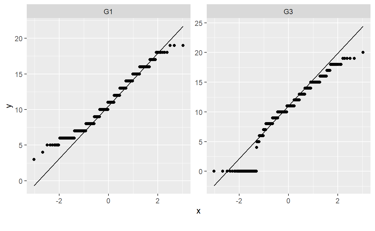
- The Q-Q plots show no departure from normality in our continuous variables (i.e., test scores from the first period and final score). Next, we will examine the presence of outliers.
Show code
df_clean %>%
  group_by(sex) %>%
  identify_outliers(G1)
[1] sex address schoolsup famsup G1 G3
[7] is.outlier is.extreme
<0 rows> (or 0-length row.names)- No outlier detected. We are good to perform Pearson’s correlation test, Chi-square test, One-sample t-test, and Dependent-sample t-test with
ggstatplot.
Scatter plot - Pearson’s correlation test
- The first function I really like is
ggscatterstat. It provides a scatter plot with statistical details to show association between two continuous variables. The plot can be used to check whether the association between two contuinuous variables is linear, as well as their distribution.
Show code
set.seed(123)

ggstatsplot::ggscatterstats(
  data = df_clean,
  x = G1,
  y = G3,
  type = "parametric",            # type of test that needs to be run
  conf.level = 0.95,

  title = "Correlation Test",
  xlab = "First period grade",       # label for x axis
  ylab = "Final grade",              # label for y axis
  line.color = "blue",
  messages = FALSE,

  label.var = famsup,
  label.expression = G3 >= 19)+

  ggplot2::theme(plot.title = element_text(hjust = 0.5))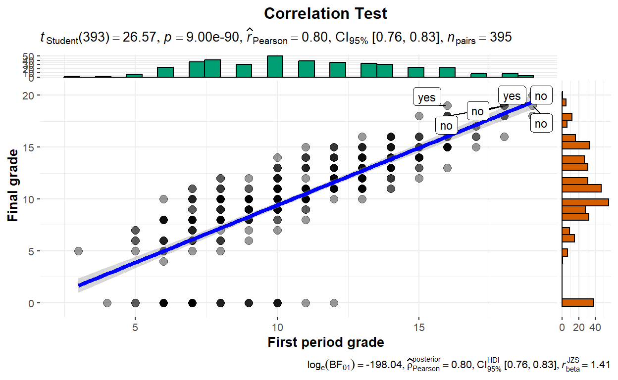
The scatter plot shows a strong positive correlation between first period scores and final scores among 395 pairs of students (p < 0.001). The meaning is that students’ score tend to go the same way; that is, if a student scores well early in their course, it is likely that their final score will be high as well. The distribution of both scores also seems normal as shown by the bar plot.
We can also flag cases with extreme value with
label.expressionandlabel.varas well for further investigation. In our case, we flag student whose final score equal to or greater than 19 and ask the function to identify whether that student gets educational support from their family.
Pie Chart - Chi-Square test
- The second function,
ggpiestats, can be used to examine “Goodness of fit” to see whether the proportions of our variable matches with what we hypothesized. We can first specify the proportion that we think our variable will have usingratioargument. Here, I hypothesized that the proportion between students who receive- and did not receive educational support from family are 50/50; therefore ,the value inratioargument is c(0.5, 0.5).
Show code
set.seed(123)

ggstatsplot::ggpiestats(
  data = df_clean,
  x = famsup,
  type = "parametric",
  ratio = c(0.50,0.50),
  messages = FALSE,
  paired = FALSE, #Logical indicating whether data came from a within-subjects or repeated measures design study
  conf.level = 0.95,
  title = "Chi-Square Goodness of Fit Test"
)+
  ggplot2::theme(plot.title = element_text(hjust = 0.5))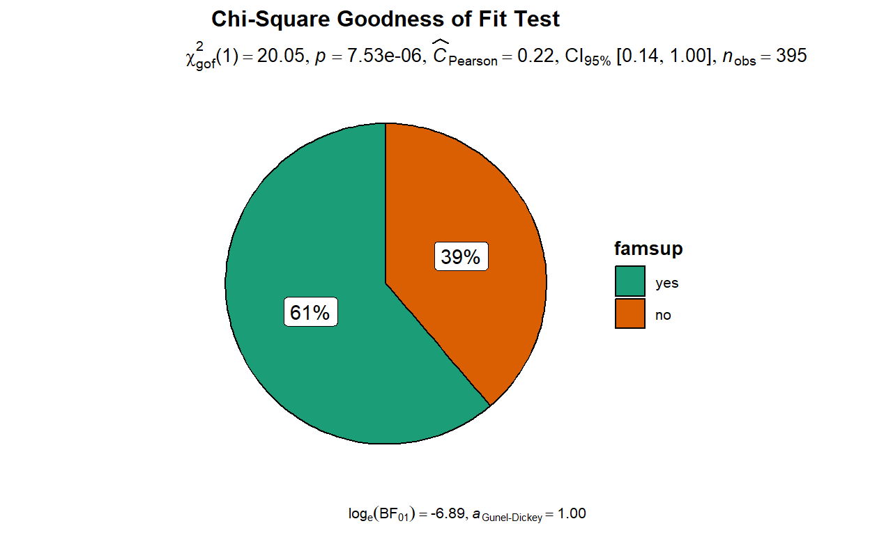
The pie chart shows that the proportion between students who receive- and did not receive educational support from family differ from what I hypothesized (p < 0.001). In fact, the pie chart shows that 61% of students from our sample receive educational support from family and 39% of students did not receive educational support from family.
The Pearson’s C value indicates effect size, which is magnitude of the result reported by the plot. In our case, the effect size is 0.22, indicating a small magnitude of difference between our hypothesized proportion and the actual proportion of our variable of interest. In plain language, it means that our hypothesized proportion (i.e., 50/50) is somewhat close to the actual proportion (i.e., 39/61).
We can also add another variable in the function to request for a Chi-Square test of independence that examines whether two variables are related. We will try examining if whether that student enrolls in extra educational support (
schoolsup) is associated with whether that student gets educational support from their family (famsup).
Show code
set.seed(123)

ggstatsplot::ggpiestats(
  data = df_clean,
  x = famsup,
  y = schoolsup,
  type = "parametric",
  ratio = c(0.50,0.50),
  messages = FALSE,
  paired = FALSE, #Logical indicating whether data came from a within-subjects or repeated measures design study
  conf.level = 0.95,
  title = "Chi-Square Test of Independence"
)+
  ggplot2::theme(plot.title = element_text(hjust = 0.5))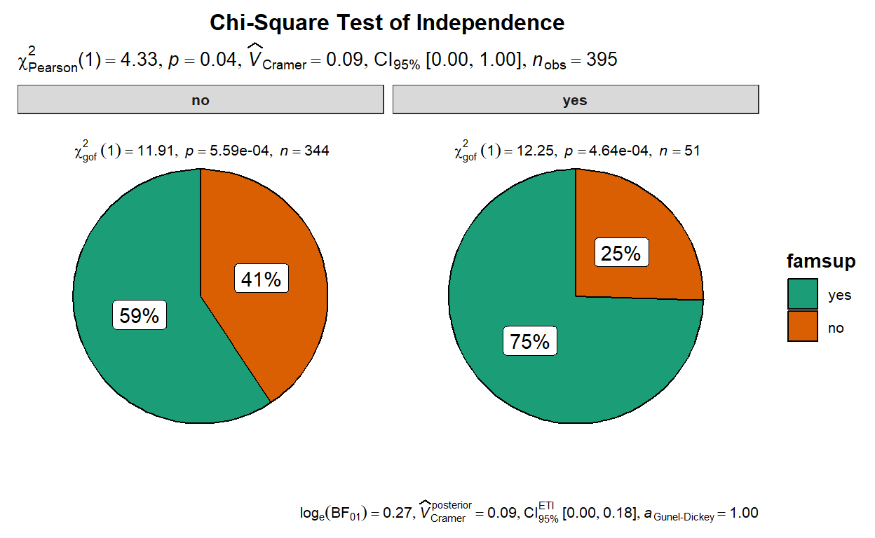
The pie chart shows a small difference between schoolsup and famsup (p < 0.05). The Cramer’s V effect size of 0.09 indicating a small magnitude of difference between the two variables. The interpretation is that there is a weak association between whether a student enrolls in extra educational support and whether that a student gets educational support from their family.
The plot also shows that the proportion within the two variables differn from 50/50 as indicated by the provided Chi-square goodness of fit results.
Histogram - One Sample t-test
- The third function,
gghistostats, can be used to examine distribution of a continuous variable and to test if the mean of a sample variable is different from a specified value (population parameter) with one-sample t-test. In the function, I hypothesized that the population mean for students’ final score (G3) is 10 as specified intest.valueargument.
Show code
set.seed(123)

ggstatsplot::gghistostats(
  data = df_clean,
  x = G3,
  title = "Distribution of Final Grade",
  centrality.type = "parametric",    # one sample t-test
  test.value = 10,
  effsize.type = "d",
  xlab = "Students' Final score",
  ylab = "Number of Student",
  centrality.para = "mean",          # which measure of central tendency is to be plotted
  normal.curve = TRUE,
  binwidth = 1,                   # binwidth value (needs to be toyed around with until you find the best one)
  messages = FALSE                   # turn off the messages
)+

  ggplot2::theme(plot.title = element_text(hjust = 0.5))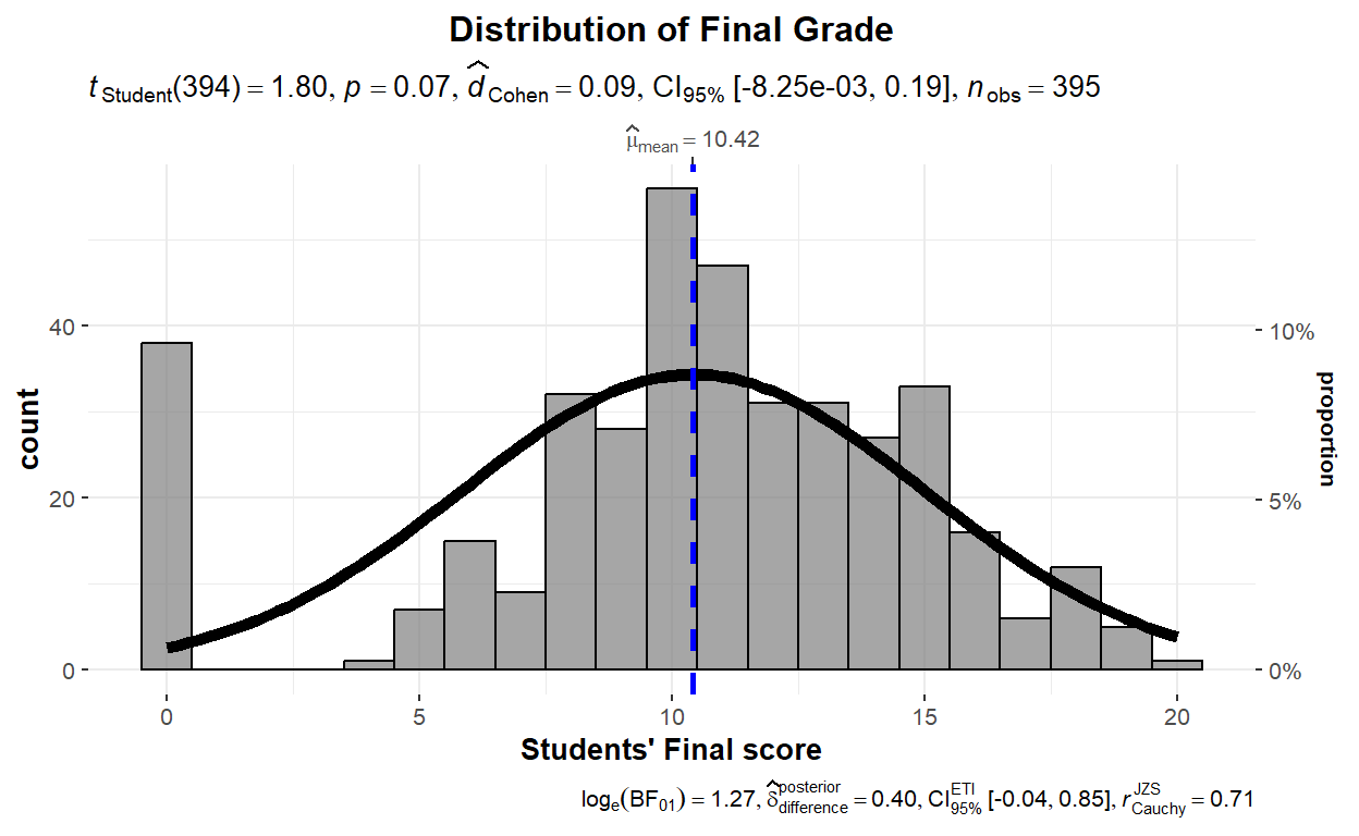
- The histogram shows that the sample mean does not significantly differ from the hypothesized (or population) mean (p > 0.05), meaning that the actual mean in our sample (i.e., 10.42) is close to the mean that we thought students’ population would have (i.e., 10). The histogram also shows that our data is normally distributed as seen from the normality curve. We will not interpret effect size (i.e., Cohen’s d) as there is no statistical significance in the results.
Violin plot - Dependent Sample t-test
- The fourth and final function we will play around is
ggwithinstats, that performs a paired-sample t-test or dependent sample t-test to determine whether the mean the two measurement time point is zero. In our case, we are examining students’ mathematics score between their first period and their final score. The function requires a long-format data set, so we will transform the data withpivot_longerfromtidyrpackage.
Show code
df_long <- df_clean %>% pivot_longer(cols=c('G1', 'G3'),
                        names_to='Measure_point',
                        values_to='Scores')
Show code
# for reproducibility
set.seed(123)

ggstatsplot::ggwithinstats(
  data = df_long,
  x = Measure_point,
  y = Scores,
  type = "parametric", # type of statistical test
  xlab = "Period of testing",
  ylab = "Students' score",
  pairwise.comparisons = TRUE,
  sphericity.correction = FALSE, ## don't display sphericity corrected dfs and p-values

  outlier.tagging = TRUE, ## whether outliers should be flagged
  outlier.label = address, ## label to attach to outlier values
  outlier.label.color = "green", ## outlier point label color

  mean.plotting = TRUE, ## whether the mean is to be displayed
  mean.color = "darkblue", ## color for mean

  title = "Comparison of students' score")+

  ggplot2::theme(plot.title = element_text(hjust = 0.5))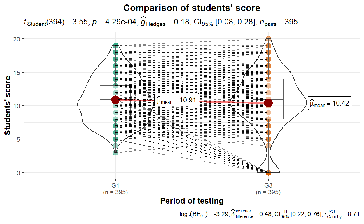
Results of the paired sample t-test are displayed along with violin plot that shows both mean and distribution density of both conditions (i.e.,
G1andG3). The results show that the mean of students’ score between two time points are different (p < 0.001). The Hedges’s g effect size of 0.18 indicating a small magnitude of difference between the two variables. The interpretation is that there is a small difference between students’ first period and final mathematics scores.The dotted lines in the plot show the pair of students between the two time points. Note that there are some students who took the first exam but did not take the final exam as shown from outliers in the final exam scores (i.e., the orange part). There are some students who scored zero in the final exam.
Conclusion
Both descriptive and inferential statistics techniques that we used in this post are mainly for data exploration. Despite their simplicity, they serve as foundations for several research that underlies products such as data driven COVID-19 policy (Li et al., 2020), validation method for machine learning algorithm (Vabalas et al., 2019), and more complex statistical analysis such as structural equation modeling (Zhonglin et al., 2004).
My point for this post is that simpler techniques should not be overlooked. In some cases, they are enough to answer research questions without relying on complex techniques that are more challenging to perform, yet provide results that are harder to interpret. Basically, if it makes sense for your work to use just a simple t-test, then there is no need to overthink. In one of our articles, we used step-wise regression instead of random forest algorithm because it performs better with a smaller sample size and is easier to interpret. Staying simple when we can is the point that I think we, as researchers, should consider in our work. Thank you very much for reading this. Happy new year 2023!